A quickstart guide to typography for brand communications
How to use typography for more engaging content and design
What you communicate as a brand can positively influence your brand awareness, customer loyalty and your bottom line. We all know this; that’s why we put so much effort into the content we create and why there is so much emphasis on copywriting to make sure we’re choosing the right words. But what about typography, the art of arranging text in a clear, legible and engaging way?
Because you might have written some killer copy but if you don’t display it in a way that attracts attention and can be digested, then it won’t get read in the first place!
But first, a crash course in the elements and hierarchy of typography.
The elements of typography: typeface, glyphs, size, weight, colour and spacing
Typeface
There are 3 basic kinds of typefaces; serif, sans serif and decorative.
You will typically have a main and secondary typeface. The main typeface is the one you use the most, often for titles and main headings. The secondary typeface is used for body text, for example, the bulk of your website. It can also be used for subheadings with a larger size or weight for emphasis.
If your main typeface is diverse enough, with enough options of fonts, glyphs, weights and style, then a secondary typeface may not be needed at all!
And if you’re wondering what the difference between typeface and font are, you’re not alone! A typeface is a particular alphabet and its corresponding accessories such as numerals and punctuation that share a common design. For example, Helvetica is a well-known typeface. A font is a particular set of glyphs within a typeface – 12-point Helvetica is a font and 10-point Helvetica is a separate font!
Glyphs - A shape, design or representation of a character; for example, the letter ‘a’ might be represented by:
a standard lowercase a
a small cap (small capital) a
a decorative (or swash) a.
Size - self-explanatory!
Weight - The thickness or boldness of a font
Colour - And importantly, the contrast between the colours used!
Spacing - The space between lines of text called leading or line height and the space between letters called kerning.
Hierarchy of typography: using the elements to structure text
So hierarchy in typography is how we use the above to structure and rank elements within a body of text.
Hierarchy is important because it determines how the text is read. When you use hierarchy correctly, you are guiding your user through your content in a logical way, making it easy for them to follow and connect the ideas and clearly understand your messages.
Using typography for legible, readable text for clearer brand communications
We’ll go through how to use typography for better brand communications for both written and visual content. For both types of content, the goal of typography is to make sure text is legible and readable.
Legibility is how clearly the text is able to be read, thanks to the design of the chosen typeface. Generally speaking, sans serif texts are considered more legible. The weight also matters; regular and bond with weights between 400 and 700 are best practices while light, extra bold and black may compromise legibility depending on the typeface.
Readability is how clearly the text is able to be read, thanks to the arrangement of the typeface. If there is not enough space between your lines and letters, it will be hard for the reader to distinguish between words because everythingbleedsintoone. Equally, if there is too much space, it will be challenging to connect the w o r d s.
Typography for written content: websites, blog posts and articles
For written content to be clearly read and understood, ideas need to logically flow from one to the other and so your text needs order.
To order your text, use headings and subheadings. The heading is usually the title of the text. The subheadings act like mini headlines for your text and describe what the associated section of text is talking about. A trick we like is that by scanning only the subheadings of your blog post, a reader should be able to gather the most relevant information and overall messaging of your content.
As mentioned above, you might use a different typeface across headings and subheadings. Or, you might choose a larger size and thicker weight for headings.
For your body text, the size will matter as well as the line length; in general, it should be 12-16pt for mobile screens and 16-20pt for desktop screens and the optimal line length is 45-80 characters per line.
Typography for visual content: social media graphics, event posters and book covers
When designing visual content, lead with what captures the most attention and make sure the key information is easily legible and readable. After you’ve deemed what this is, you want to create visual interest to engage and visual contrast to be read.
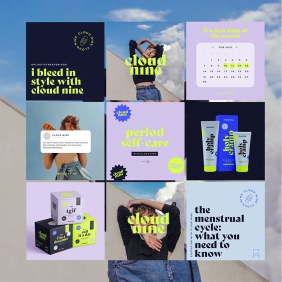
For visual interest, you could use a decorative typeface for the video, festival or book name and pair it with a more common but complimentary typeface for the names of the artists and author. As a rule of thumb, never use more than 3 different typefaces; otherwise, your content will be too overwhelming on the eyes!
To make sure everything is still legible, take care with weight, size and spacing – and also colour. When it comes to colour, you can contrast with dark and light colours, with colour temperature and with colour intensity.
You might think of black and white for dark and light colours, but it can be much more and if you’re unsure about whether it’s still legible, turn your design greyscale and you’ll immediately see!
With colour temperature, we mean pairing warm and cool colours together such as blues and yellows. This has quite a dramatic effect so could work well for social media graphics like the first slide of an informational Instagram carousel because it could stop someone mid-scroll!
Colour intensity refers to how saturated and therefore bright the colours are; the brighter the colour, the attention it will likely get - so maybe your book cover is a dark colour, the book title is in a bright red and the author’s name in a muted red.
In short, typography is a powerful tool that can help ensure the content your brand is putting out is actually being consumed the way you intended! It can also be like the cherry on top of your brand's sundae, adding flavour and personality. To learn more about typography and how it can impact your brand and business, here are our favourite resources:
Type Connection A typographic dating game that helps you pick perfect font combinations
Wordmark.it Displays preview text using all the fonts installed on your system
What the font Upload an image and it magically tells you the name of the font—works surprisingly well.
Fonts in Use An archive of fonts in use in the real world. Provides inspiration if you need to pair fonts.
Incredible Types A curated collection of nice typography featuring mostly print work. Great for inspiration!
If you want to know how your typography could be taken to the next level, we offer complimentary 15-minute enquiry chats to begin explorations! All 3 suites of our branding services will come with a typography suite so no matter which suite you choose, you’ll be all set for a unique, cohesive and strong brand identity with design guidelines for clear messaging! And we guarantee that we’ll have a blast along the way together.
Want to get all the juicy goss about branding and illustration straight to your inbox?
Sign up to my monthly newsletter today!


